Here are some of the changes you’ll see—and why we made them.
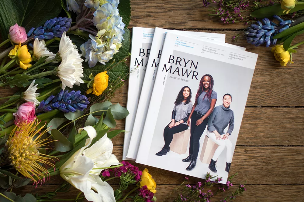
Why the new size and font?
The size is a throwback to the original 1921 Bulletin’s design, which an alumnae focus group liked and found easy to carry. The font, Berlingske, reminded an alumna of the letters sent by Betty Vermey in Admissions.
And the new look and feel?
To liven things up, we’ve introduced a number of design touches: new full-page section openers that make for a more navigable magazine, blue borders that make it easy for you to flip right to Class Notes, and numbered Archways stories that are just a fun touch—and, no, you don’t need to read them in any particular order!
Tell us about the new Discourse section
A broad survey of alumnae found that Mawrters wanted more intellectual content and more alumnae/i voices. Discourse provides both.
Are there other improvements on the way?
Later this year, we’ll launch a redesigned magazine website. Also, look out for more news of the Alumnae Association in the Bulletin!
We’re excited about the new Bulletin and eager to hear what you think. So send us your feedback!