Bryn Mawr has completed its first-ever comprehensive Institutional Positioning project, which unifies how the College presents its key qualities, values, and personality to our community, prospective students, and the wider world through both words and visual design.
Launched in the fall of 2023, this project was led by the College’s Office of Communications in partnership with women-owned research firm SimpsonScarborough. Hundreds of Bryn Mawr community members participated in the project’s three phases to offer opinions and feedback about what makes Bryn Mawr distinct.
Inspired by the past to inform our future, the team dug into the archives to draw inspiration from how the College was depicted previously and how it looks today. They examined items like the owls depicted in the pages of old yearbooks and lanterns that have changed shape over the decades.
The results of this work are emerging in places like our campus signage, on the website, on the Bookshop shelves, in new descriptive language about the College, and in brochures for prospective students. The verbal identity underscores Bryn Mawr’s academic excellence, values, and culture, and the new visual identity embraces longstanding traditions but with bolder and brighter visuals that reflect our refined, thoughtful, and distinguished College community.
What does this look like in practice? Let’s break down some of the design elements!
Architectural Patterns
The campus architecture has been rendered in patterns that can be applied to our design. While they may appear abstract at first glance, look a little closer, and you will recognize the familiar painted ceiling and leaded windows of Great Hall.
This pattern was inspired by
the interior ceiling of Old
Library.
Many of the windows of the
gothic style buildings on
campus feature this or a
similar diamond pattern.
Carved along the upper arch
of one of the campus' many
arches is this scale pattern.
The College Seal
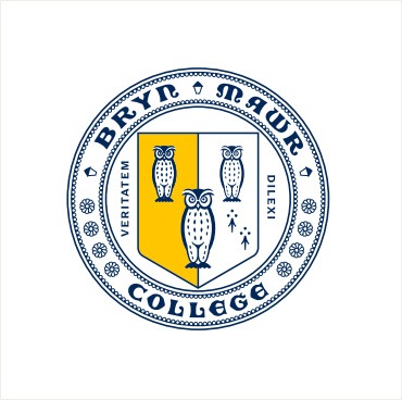
This fall, the board approved an updated seal. The seal still features owls and daisies, plus the motto “dilexi veritatem,” or “delight in the truth.” The seal will be featured more frequently in our College logo to highlight our academic strength.
Colors
Our signature yellow is now named “Lantern’s Glow,” and the golden hue has already been adopted in in signage, postcards, and on mugs and sweatshirts in the College Bookshop. White and Lantern’s Glow remain the College colors, accented by navy and a palette of complementary colors.
PMS 7548
RGB: 255/198/0
CMYK: 0/20/100/0
WEB: #FFC600
PMS 295 C
RGB: 0/40/88
CMYK: 100/63/0/67
WEB: #002858
RGB: 255/255/255
CMYK: 0/0/0/0
WEB: #FFFFFF
Light Rays
Evoking the lantern and the light of knowledge, light rays are a simple but effective design touch that reflects how Mawrters are lantern-bearers and represents the icon lantern light.
We rarely use the full sunburst,
but the graphic exists as a whole
so it can be cropped into other
ratios as needed.
These work best when aligned
to the horizontal or vertical
middle of a composition or
piece of copy.
These work the best in corners
or other smaller places in a
composition.
Publisher’s Marks
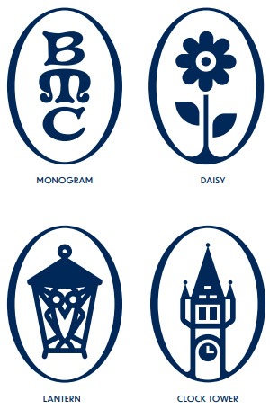
This new design vision for Bryn Mawr was inspired by one of our favorite things – books! Literary influences pepper this new visual identity, including in the new “publisher’s marks.” Featuring the tower of Taylor Hall; the college flower, a daisy; an owl; and, of course, a lantern, these marks are fun decorative accents that feature beloved icons of the College.
Look for continued integration of the positioning work in Bryn Mawr's communications moving forward. For a comprehensive look at the Institutional Positioning work and to access resources including Power Point templates, visit the Institutional Positioning Guide.


